
When To Use Fluid Engine (And When Not To)

Back in July 2022, Squarespace released Fluid Engine...and the response has been ‘meh’. If you're on Squarespace 7.1 (and let's face it, you should be), then Fluid Engine is the default builder. The good news is you can still access the Classic Builder (more on that below).
In a nutshell, Fluid Engine is a 'drag and drop' editor, supposedly catering to the non-tech savvy. It’s similar to how Wix operates (don't even get me started on Wix...).
THE GOOD THINGS ABOUT FLUID ENGINE
One of the bonuses to Fluid Engine is that your images can now stretch to the sides of the block. What does that mean exactly? Well, here's how images look in the Classic Editor… there’s white space on all sides of the image.

Another new feature is that you can now overlap text and images whereas in the Classic Editor those blocks are separate. In the image above, the text and image are in totally separate groups. There’s no way to overlap them (not without code, at least…).
THE NOT SO GOOD THINGS ABOUT FLUID ENGINE
The Classic Editor automatically adjusts your website so that it's responsive on a mobile device. Not so for Fluid Engine. You will need to go to the mobile editor to readjust text and images so that everything aligns correctly.
*Important: Any changes you make to the mobile editor only effect mobile... not desktop. (PS: That’s a good thing)

It's a lot of extra work having to tweak each section of a page to ensure that it's correct on mobile. Whereas with the Classic Editor, you're good to go for mobile devices.
Another pet peeve about Fluid Engine? The grid system. There's no 'in-between' when it comes to a layout because everything 'locks' into the grid. For example, this is how the section looks on the live site (built with the Classic Editor). Notice the size of the button…It’s a good width and height and matches the buttons on the rest of the site.

Now here is the same design but using Fluid Engine. The button is much larger. You can see that it is 4 blocks wide and 2 blocks high on the grid system.

“Well, just make it not as wide,” you say…. Done. Now we have an even bigger button that is 3 blocks wide and 2 blocks tall.

So, let’s make it 1 block high (instead of two) and that will make it not so fat. Ok, great… now we have a super thin button. Not to mention the fact that both of these buttons look wonky on mobile devices, too. The thin button in the image below wraps the text to the next line while the Classic Editor button maintains it’s shape on mobile.

So you can see why Fluid Engine can be frustrating. There’s no win/win on the button situation… you either have a huge button or a thin button. Which is why I stuck with the Classic Editor for this block.

WHEN I HAVE ACTUALLY USED FLUID ENGINE
For me, the pros just don't outweigh the cons. However, there are SOME cases where I have chosen Fluid Engine. In this example, I really wanted a classy look with a block of text in the middle and images on either side. Here's how it looked in the Classic Editor (I added the black border so you can see the size of the entire block) -
Not great.
The image doesn't stretch to the top/bottom/sides and the red is only behind the text, whereas I want it to be the same size as the images.
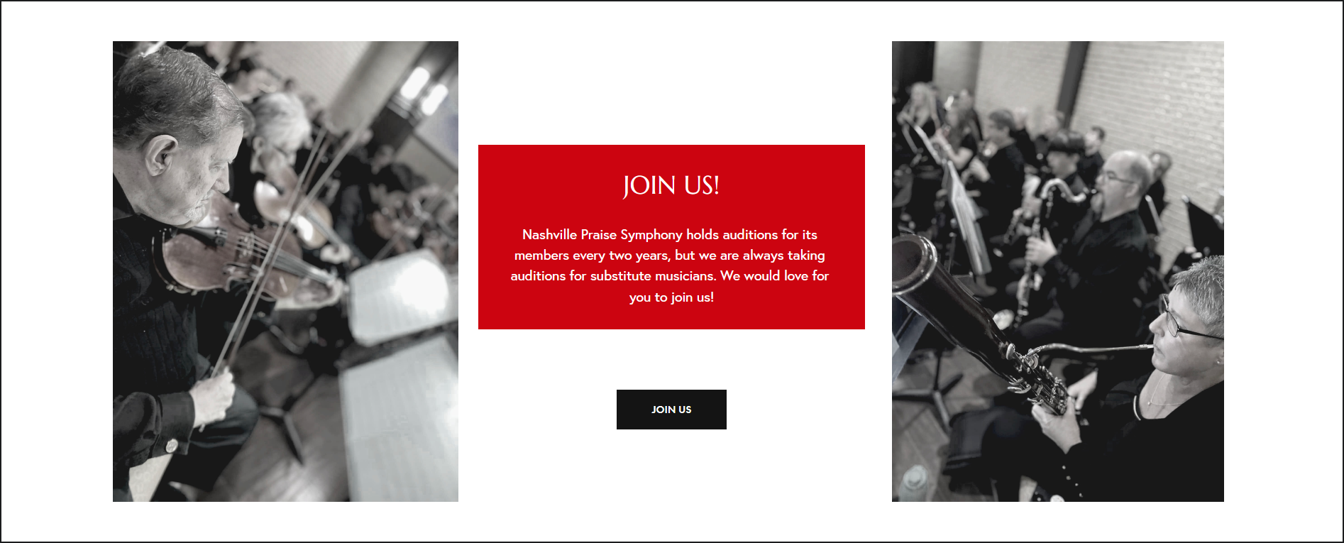
Here's how it looks in Fluid Engine -

So. Much. Better.
Since Fluid Engine allows you to overlap text and images, I was able to make the red box an image (I created it in Figma) and then placed the text and button over it. View it on the live site at nashvillepraisesymphony.com.
The Fluid Engine design looks great on mobile too. Here are the two variations on mobile:
CLASSIC EDITOR

FLUID ENGINE

SO WHAT ELSE HAVE I BEEN USING FLUID ENGINE FOR?
Um, well... not much. I set out to create a site entirely on Fluid Engine and ended up reverting almost every block back to the Classic Editor.
Still want to use the Classic Editor? When you go to add a new block, scroll down to the very bottom and you will see two links. You can either create a blank block (which is what I do) or you can click the link at the bottom to view all of the sections in Classic Editor.

HOW DO I KNOW IF A BLOCK IS FLUID ENGINE OR THE CLASSIC EDITOR?
Good question! If you hover over your block and it says "Upgrade" in the left corner then your block is using the Classic Editor. If it says "Add Block", then you're using Fluid Engine. It IS possible to build a page using both types of blocks on the page.
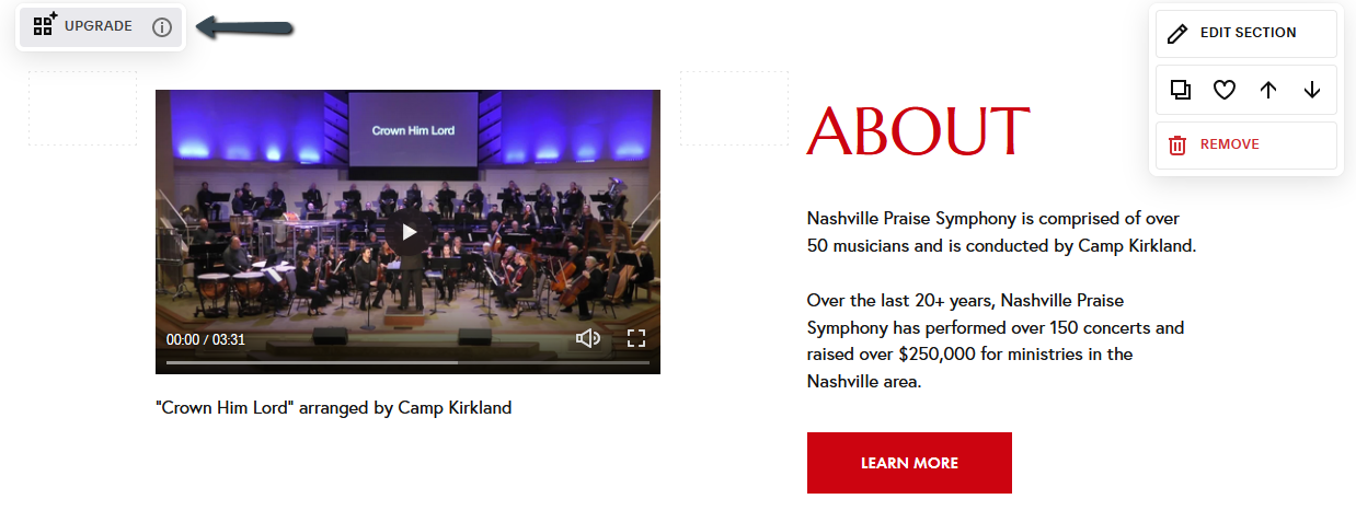
If you already have blocks on existing sites using the Classic Editor, I don't recommend clicking that "Upgrade" button, no matter how tempting it may be. If your site already looks good with the Classic Editor, then keep it that way. If it ain't broke, don't fix it. Because you definitely will be fixing it with Fluid Engine!! Ha.
Have you used Fluid Engine? What are your thoughts?
