Functional and Cutting-Edge Website for a Music Arranger
BILLY PAYNE MUSIC
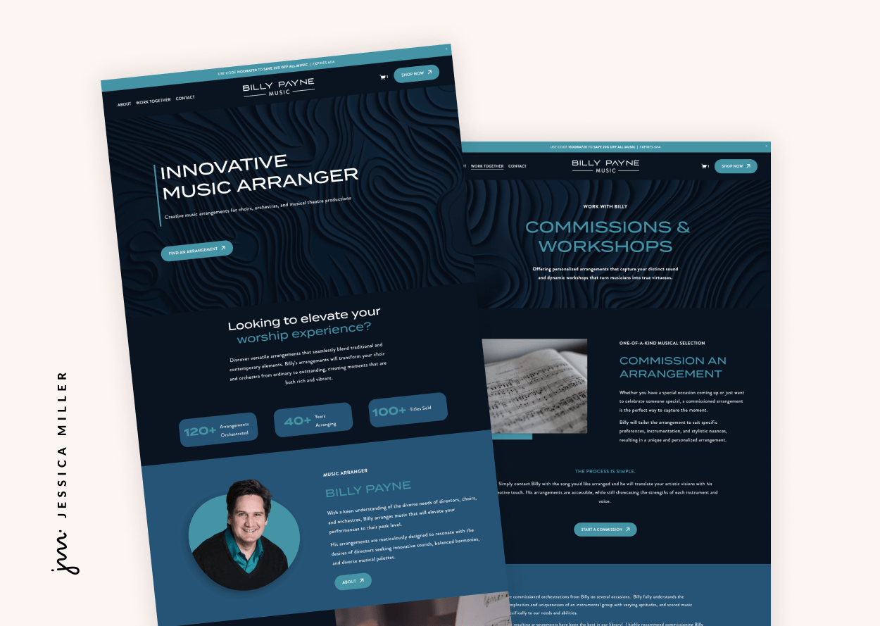
Billy Payne has been arranging music for decades and needed an engaging, user-friendly website to sell his arrangements. To ensure ease of navigation and a captivating experience, I selected two complementary shades of blue for the site. The color blue conveys reliability and security, which often encourages users to make purchases.
For his logo, I chose a masculine font and creatively modified the letter 'A' to play off the 'Y' in his name, resulting in an eye-catching and memorable design.
I incorporated subtle visual elements, such as a tilting arrow on hover-over buttons, to keep users engaged. For the store, I used Universal Filter, allowing users to easily sort titles by instrumentation and season.
Each song page features an audio demo and a PDF score preview, with related items linked in a "you might also like" section so they are easy to find.
With only two images of Billy to work with, I adapted the main image of him by changing his red sweater to teal to fit the color palette. To complement these images, I sourced music-related visuals and then edited them to match the site's theme.
Without a central image to build around, I created a unique design with navy blue swirls, which became the site’s focal point and inspired the cover images for each arrangement.
Now, Billy has a professional, visually cohesive website that not only sells his music effectively but also elevates his branding to match the quality of his arrangements.
I knew Jessica would create a great site because I had seen her work elsewhere. She was very patient with me and quick to answer questions and brainstorm ideas on how to create a solution for my needs.
If you are on the fence about hiring a web designer, just do it. The designer knows more than you and is there to help you get you were you need to go.
- Billy Payne
Scroll through the home page
Pin this post to Pinterest! 👇🏻


