How to Replace a Background Image for Mobile
Pin this post to Pinterest! ☝🏻
Have you ever noticed that sometimes things don't look the way you intended on a mobile device? You spend all of that time getting the layout just right for the desktop view, then you switch to mobile aaand ... it looks wonky!
Psst - did you know you can test the mobile view on a desktop? Just click the mobile icon on the right to switch to mobile view.
THE PROBLEM:
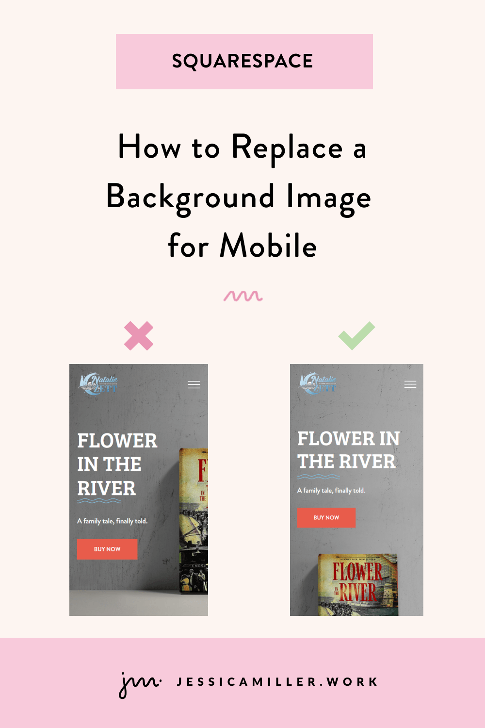
I recently created a site for an author that was selling her book. The desktop version looked great with the book image to the right and the text to the left. But on mobile? Yeah, not so much. The book was completely cut off.
The image of the book is a background image (instead of an image block), which means that we can reposition the focal point of the image by dragging the circle to another place on the image.
NOTE: Repositioning the focal point for mobile is only available on fluid engine, not the classic editor.
That doesn't really fix the problem for 2 reasons:
1. I don't want the book image behind the text because it's hard to read the text or see the book. Ideally, I need the book to come after the text.
2. If I reposition the focal point on mobile, it's also going to reposition it on desktop (and I already have the desktop view how I want it!).
SO… instead, we can create a new background image that only loads on a mobile device. This way our desktop image stays how we want it and the mobile view will also look clean.
I went into Photoshop and created a new image for mobile that can be imported as a background image and then we will lay our text and button over it.
CSS TO REPLACE THE BACKGROUND IMAGE
By using some simple code, we can add this image to our site. To add the code, log into the back end of your site and go to Website -> Website Tools -> Custom CSS. Here is the code you'll need. Go ahead and copy and paste it into the CSS editor.
#collection-63b158dc4453123e8962kerq8 {
 @media only screen and (max-width:640px){
  #page .page-section:nth-child(1) .section-background img {
    opacity:0;
  }

  #page .page-section:nth-child(1) .section-background {
    background-image:url('YOUR URL HERE');
    background-size: cover;
    background-position: center;
    background-repeat: no-repeat;
  }
 }
}
There are 3 parts of the code to change
1. The collection ID in the first row. To get this, install the Squarespace ID finder in Chrome (it's free!). Then go to the page on your site with the image that you want to swap. Launch the Squarespace ID finder and you will see the collection at the top. Click the collection ID and it will copy the ID. Then paste it where the collection ID is in the code.
2. You'll need to replace the number in the parentheses for .page-section:nth-child(1) (both of them) depending on which section your image is in. Mine is in the first block of the page, so I will leave it as "1", but if yours was in the 4th section of the page, you would put "4" inside both sets of parentheses.
3. Lastly, upload the image and add the URL where it says YOUR URL HERE. To upload your image, click the Manage Custom Files button underneath the CSS editor. Click "Add images or fonts" and upload your image. Then, go back up to the code and remove the text YOUR URL HERE.
IMPORTANT: Be sure to leave the ' ' marks that are on either side of YOUR URL HERE. Place your cursor between the apostrophes so that it's blinking. Then click Manage Custom Files again and click the image you uploaded. That will insert the image url into your code.
Here is what my code looks like once I replace everything -
NOTE: Your code will not look like this - mine is specific to my image and collection number.
#collection-63b158dc4784523e8962ebc2 {
 @media only screen and (max-width:640px){
  #page .page-section:nth-child(1) .section-background img {
    opacity:0;
  }

  #page .page-section:nth-child(1) .section-background {
    background-image:url('https://static1.squarespace.com/static/64513f48a51d854c02f2d3bc/t/647656a5ac16d304e59d2cb3/1685477029374/flower-in-the-river-mobile.png');
    background-size: cover;
    background-position: center;
    background-repeat: no-repeat;
  }
 }
}
go to your mobile device and test it out!
Here's how mine looks with my new image -
If you try this on your site, let me know how it goes!


